Thursday, October 30, 2014

Week 10 - Journal Entry 1 - Type Videos and Hierarchy Projects

Of the kinetic typography videos that I watched, the ones that I thought were most effective are titled
"Make It Better"  and "JBFM." They are both posted below.


"Make It Better" was very effective, because although its audio track didn't contain any speech, the designer manipulated and utilized the type in a way that reiterated the main idea of the video. It showed the process of starting with ordinary text and continually working to make it better. There aren't too many graphics and the main focus of the video still relies on the typography. The color choice is modern and the entire video is clean and uncluttered. Everything is legible.


"JBFM" worked well in utilizing the type to create form. Without having any verbal speech, it still was able to clearly convey the main focus of the video. The colors work together well and are interesting. The motion of the typography moving throughout the instruments make the video much more dynamic than if they were still images of instruments created from type.


There were other videos that I found interesting and worked well. They're also posted below.


These are all great. They all use type of different weights, and through placement and motion, help to convey emotions that connect with the main subject of the videos. They also do not use many graphics, and instead, they use typography to help create the illusion of graphics. With possibly the exception of the New York Times video, I just didn't find them be as unique as the top 2.

Below are two pictures of my revised hierarchy project. The first one is the one that I had created for class today. I decided to revise it after class because I wasn't sure whether or not I liked the large black triangles, and if they worked well with the design. I think after editing it, I'm more attracted to the second design now, although I'm still not sure.


Thursday, October 23, 2014

Week 9 - Journal Entry 1 - Monologue Idea and Hierarchy Revision

I've decided to change my monologue idea again from the Rocky one, and have instead, chosen to do a scene from the show How I Met Your Mother.  The dialogue can be seen below.


In text, Barney says:

"I love everything about her, and I'm not a guy who says that lightly. I am a guy who has faked love his entire life. I thought love was just something idiots thought they felt, but this woman has a hold on my heart that I could not break if I wanted to. And there have been times that I wanted to. It has been overwhelming, and humbling, and even painful at times, but I could not stop loving her anymore than I could stop breathing. I am hopeless, irretrievably, in love with her more than she knows."

One of the problems I'm currently facing as I'm working through the monologue is fitting in all of the text onto one spread in coherence to my sketches. Another issue I'm having is figuring out how to deal with the punctuation, since there are some parts in which run-on sentences occur.

I contemplated choosing a scene from Breaking Bad where Walter says "I am the danger" and "I am the one who knocks," both of which are popular and memorable lines from the show. However, the speech was a bit too long, and if I had excluded the beginning few pauses, the speech wouldn't have been as dramatic. Many people have also already done a motion typography video for it, so I figured the speech from Barney would be more original.

I met with Professor Mata to talk about my composition to get some feedback, which was really helpful. I've begun adding the revisions and am understanding the assignment a bit more now and will post pictures of it once I've finished.

On Tuesday's class, we had approximately 30 minutes to recreate the hierarchy composition, except on an 8" x 10" document this time. Below is a picture of how mine turned out.


I was told that I should make the lines slightly thinner. They stand out even more in comparison to everything else once it's printed. I would have made the revision, but this is how it looked for the critique so I am posting it as-is. If I were to fully revise this though, I would change the weight on the word "center" to make it more noticeable. I should also make the horizontal lines thinner as mentioned. Kerning and leading could also use a lot of work. Aside from the smaller details, I'm fairly happy with the composition of it.

We then had to revise or recreate another one for homework. Instead of revising it, I chose to create a new one, because I figured making minor changes to it wouldn't feel as fulfilling. Below is how my second one turned out.


Overall, I'm not too satisfied with out this one turned out. I didn't give myself enough time to work on it, which I should have. I mostly don't like it because the middle column reminds me of a receipt. There are things I would revise about this, such as the kerning, leading, and overall composition. I would resize some of the type and probably rearrange it as well. It looks better horizontally then vertically, although the middle column wouldn't be very legible. The words Jazz and Ballet become easier to read then. Although we didn't have time to go over it today in class, it was due today, so I am posting it here as-is.

Thursday, October 16, 2014

Week 8 - Journal Entry 2 - Monologue Idea

Today we finished our class presentations on typographers. We then took a group photo and pictures of individual students with their designs on. Afterwards, we covered more information and details about how to start the monologue project.

Originally, I selected two clips from Parks and Recreation which I wanted to use, and they are posted below. I've decided not to use them, because they resemble lists more than something that could tell a story.

Ron Swanson Video
I have to post this first clip via link rather than embedding the video, because it won't seem to show up in the search. It directs to YouTube, and the part I originally wanted to use is from 3:42 - 4:30. I was going to crop out certain parts to make it fit into 30 seconds, including only the part where the first shows the board and where he goes into listing parts of it.


The second clip is above, and I would clip the first few seconds and use mainly only where he lists off the food names.

I wanted to use both of them, because they're humorous, and Parks and Recreation is one of my favorite shows. After seeing Tim's video, I realized how much more impactful I could make the video by using a monologue that actually tells a story.


The video clip is from the Rocky Balboa movie released in 2006. The part I plan to use is from 1:51 - 2:22 so it would be a total of approximately 31 seconds, depending on how I clip it.

In text, the lines are read:
"You, me, or nobody is gonna hit as hard as life. But it ain't about how hard you're hit. It's about how hard you can get hit and keep moving forward, how much you can take, and keep moving forward. That's how winning is done! Now if you know what you're worth, then go out and get what you're worth. But you gotta be willing to take the hits and not pointing fingers saying you ain't where you wanna be because of him, or her, or anybody! Cowards do that and that ain't you! You're better than that!"

Tuesday, October 14, 2014

Week 8 - Journal Entry 1 - Visual Hierarchy

I realized that I had not yet posted my visual hierarchy designs, so here they are.

For this project, we were given the following lines:
Dance
Jazz and Ballet
Kimmel Center, Inc.
Instruction in Ballet and Special Exercise Jazz
Pam Turner, Jazz
Gene Hammett, Ballet
Director, Myra Wrenn
Registration now through November 15, 2014
260 South Broad Street on the Avenue of the Arts
Philadelphia, PA 19102
Phone: 215.790.5800
Fax: 215.990.5801

For each design, we were given set parameters within which we had to follow to achieve visual hierarchy.

The parameters for each design were as follows:
1. Use the same type, size, and weight
2. Use the same type, size, and different weights
3. Use different type, different size, and different weights
4. Use different size, weights, and varied letter spacing for emphasis
5. Use an interpretive manipulation of type to reinforce the message

The objectives of the assignment were:
Use visual hierarchy by changing typographic parameters
To view letters as forms and experiment with combinations
To utilize type as a visual element, and an abstract and interpretive design element

Two sets were created. The size of each individual composition was 6" x 6", but for the purposes of sharing them on the blog, I took my before and after compositions, placed them into a single photoshop document, and uploaded them afterwards. That way, they would appear next to each other to make it easier for people to compare the two. People can also click on the image to enlarge them. Because of screen resolution differences, I figured the safer route would be to not make the resolutions of them smaller. In each composition, I switched between uppercase and lowercase letters to create emphasis, so I will not be mentioning that further in detail, but below are comparisons of my before and after sets with the image on the left being my "before" and the one on the left being the "after".

The first composition utilized only Tw Cen MT. The second utilized only Futura. Without being able to create emphasis through different weights, typefaces, or varied letter spacing, I had to base my composition off the fact that people in the US read from top-to-bottom and from left-to-right. I wanted to avoid centering all of my information in a vertical column down the middle, because it felt cliche. The one on the left reminds me of a letter or memo. Professor Mata suggested that I put the "Dance, Ballet, and Jazz" into a single column and mentioned that the size of the font was a bit small. I made the alterations and ended up the one on the right. The biggest lesson I learned from creating these two was how effective a simple change in font size could make.

The first one includes only Tw Cen MT, while the second includes only Helvetica Neue. Because the type and size had to stay the same, while the weight was allowed to be changed, I had to pick a typeface with many different weights. On the left, it's evident that I didn't take full advantage of the use of different weights and mistakenly chose Tw Cen MT as the typeface. The hierarchy is there from top-bottom as previously, but it's not appealing. I chose Helvetica Neue for the one on the right. My main goal was to capture the reader's attention through the contrast of bold type against the light type. From first glance they would see and read the bold type, and if interesting, could read into the details of the lighter type. The negative space in the second composition helps to make the positive space more noticeable.
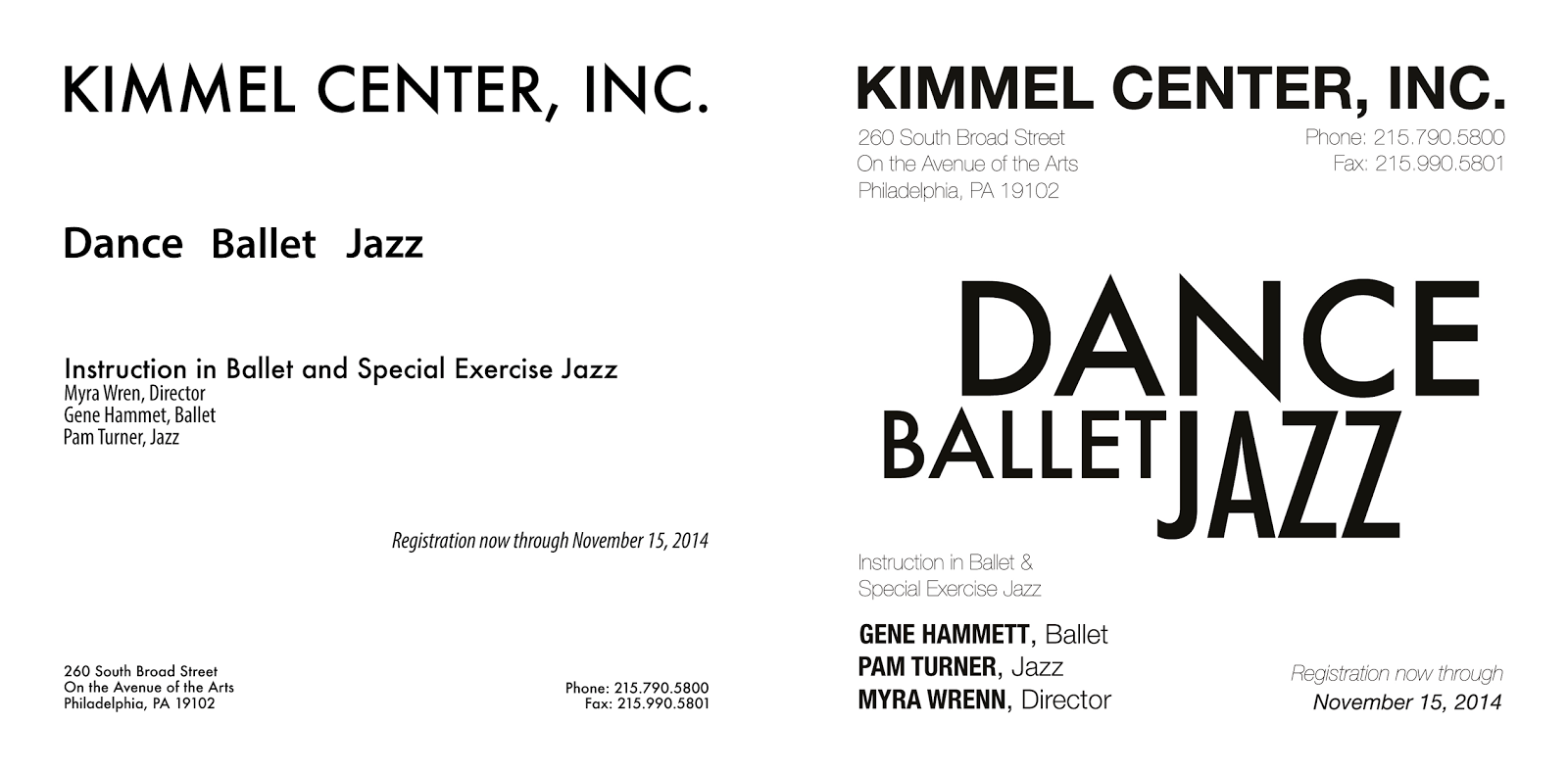
I used Futura and Myriad Pro for the first one. For the second, I went with Future and Helvetica Neue. Type, weight, and size could all be changed. The hierarchy is there on the left, but it's still boring and doesn't appear as modern as I wanted. On the right, I took what I learned from the first composition of using type size to my advantage to make "Dance," "Ballet," and "Jazz" stand out. It activates the negative area and captures the reader attention from first glance. Similar to the last composition, I wanted to achieve hierarchy primarily through weight and placement.
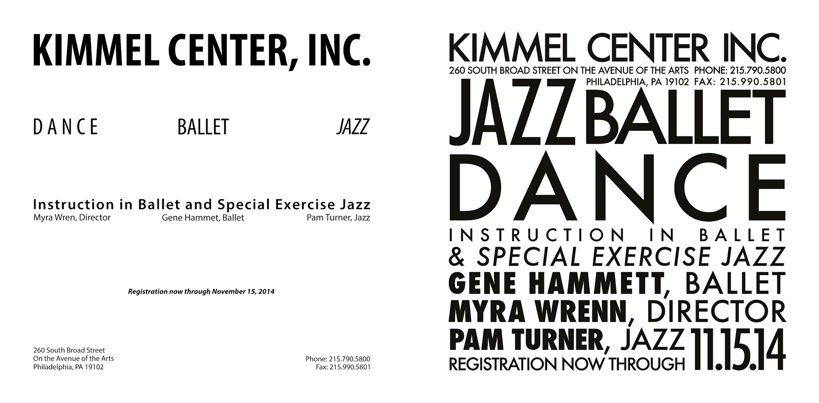
I used Myriad Pro for the first one and went with Futura for the second. Again, the hierarchy seems to be there on the left, but it still appears a bit boring and generic. I switched to Futura, because it's a typeface that appears modern and seems to resemble the one on Kimmel Center, Inc.'s website. Those are also reasons why I used Futura frequently in my other designs. The way the "N" slightly extends beyond the cap-line and baseline appeals to me. I wanted to try to take full advantage of being able to vary the letter-spacing, so keeping in mind that I wanted to fill up the entire space of the picture plane, I eventually ended up with the design on the right. I still tried to maintain visual hierarchy through weight, size, and placement, but added the letter-spacing for emphasis and visual appeal. It is probably my favorite design of all of the ones I created. The only things that bother me are the commas in the second one. I contemplated deleting them, but didn't want their titles getting mixed in with "& special exercise jazz". I should have perhaps gone with Helvetica Neue so I could have used the light weight for one of those to differentiate them.
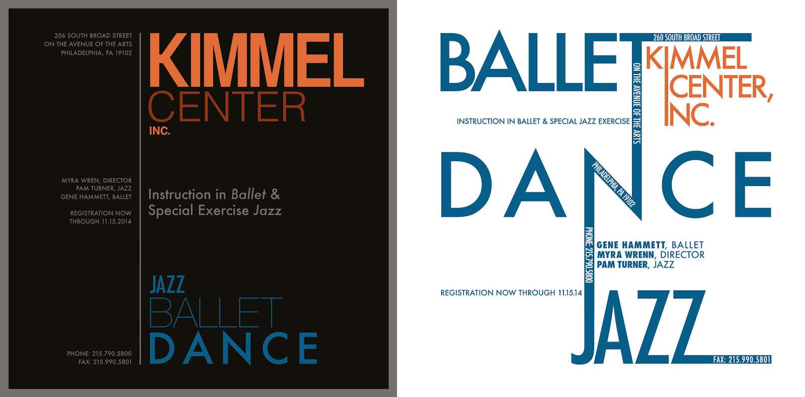

For the first one, I went with Helvetica, Helvetica CY, Helvetica Neue, and Futura. For the second one, I went with only Futura. The inspiration for the first one came from both Professor Mata's T-Shirt Design rubric, and my older brother's resume. I screen-captured an image from Kimmel Center, Inc.'s website and used the eyedropper tool to get the colors to match their site. The black background was meant to resemble a dark theater. I wanted a modern and clean look in the first one, which I partially achieved, but the typeface in "Kimmel Center, Inc." appears a bit old and not as appealing as "Jazz Ballet Dance." The inspiration for the second one came from some images I found on Google after typing in "good typography". From the first critique, we discussed the fact that placing a word at an angle creates movement. I later realized that movement in type is created simply from the order in which they are presented. Whereas in a drawing, people move around a composition according to line they see, type creates the same effect. People read information and words in the order that makes most sense to them, so I tried to use that to my advantage. I wanted to create the idea of roads or pathways and parking lots, with smaller roads connecting and intersecting with each other. I prefer it without the black background, because it seems easier to read. I didn't fully achieve the look I was going for, and while the hierarchy still seems partially there, it's not visually appealing enough for me. I should have turned the entire composition counter-clockwise slightly so that none of the lines of text would be at an exact vertical, which would make those lines of text more legible. The part with Gene Hammett, Myra Wrenn, and Pam Turner should maybe have a different typeface, weight, and/or placement. I tried to balance the horizontal lines extending from Jazz and Ballet with the lines of type on the left, but I'm unsure if it's enough. The vertical line in "Kimmel Center, Inc." resembles a road which I wanted, but it also makes the word "Center" almost appear as "Icenter," which isn't good. Overall, it could still use some work before it's where I would want it to have that "wow" factor. I do think it's better than my first rendition of it, however slightly. I'm unsure if it's better than my fourth one though.

Overall, I learned a lot about typography through this project. Experiencing it first-hand and discovering all the work that goes into trying to create good typography provided a good connection to what I have read and been taught about it in lecture. I have a new respect for designers who create good typography, because it's extremely time consuming. It's fun, and hopefully, I'll be able to effectively integrate into my future designs.

Thursday, October 9, 2014

Week 7 - Journal Entry 1 - T-Shirt Design and Typographer Presentation

We presented our research and t-shirt designs to the class today. Below are some progress pics along with pictures of my powerpoint presentation in chronological order as it was presented.


The powerpoint was straightforward and was used more for notes and key points on which I could elaborate about during my presentation. I chose to use Myriad Pro as the typeface on the slides, because Carol Twombly helped to create it.

Below are pictures of different designs that I created, and they show how I progressed towards my final one. I've decided to post them, because each individual picture was a possible design that I could have chosen to use. As it turns out, the last design I created just coincidentally wound up being the one I decided to go with.

The main idea of my design correlates to the fact that Myriad Pro replaced Garamond and has become one of the official typefaces used by Apple for their marketing purposes. Myriad, by definition, also means "a countless, or extremely great number," so Professor Mata gave me the idea to have the words "Myriad Pro" recreated multiple times. She knew that it had many different weights, so I would have been able to create an interesting design.

This was my initial design, and I contemplated having it either on the upper-back or mid-chest on the front. The apple measures approximately 5" x 6.5", including the leaf at the top. I wasn't aware of the typo that I had made in the word "Myriad" towards the top left bold-faced section until one of my later productions, so I fixed it for those designs and could have for this one. I decided to not bother changing it because I knew at that point that I wasn't going with this design. The type is distorted and fairly illegible, so I knew I had to add more to it to actually make it coherent with the design.

Originally, my idea was to put the earlier design of the apple over top of the silhouette of the apple that I have here. There wasn't enough contrast between the color and size of my fonts to create the look I wanted, and so I decided to get rid of the text in the apple. The shape of the apple still seemed too difficult to see in this one. One of my favorite parts of this design, is how most of the words are cut off except for the one at the center-bottom. The words Myriad Pro appear in order as opposed to saying "Pro Myriad" and it lets the viewer know what words I'm depicting throughout the design.

This is similar to the one above it. I inverted the colors of the type and added a gradient to bring forth the shape of the apple.

The previous design still seemed to lack contrast, so I made all of the type black. The gradient here helps to add depth to the letters so that they don't appear as flat. The small square at the top left was going to be printed on the same sheet, but cut out and ironed onto the bottom-left corner of the hoodie just to add some color elsewhere than the design. The square would have been better as a separate patch of cloth stitched on than an iron-on, though.

This is basically a combination of the first design with the fourth design. Whereas it didn't seem to work when I combined the first and second design, by adding a gradient and inverting the colors of the type on the apple, it created a strong enough contrast between the object and the background. The contours of the apple add a slight 3-dimensional illusion. Again, the small square was placed there to be integrated into the hoodie separately.

Again, this is similar to the previous design. I was just trying to add colors that could abstractly represent silky streams of paint and integrate them into the design rather than having a square placed separately. This particular design, especially with the streams of colors, was heavily inspired by Avicii's lyric video for his song "The Days."

Here I was just messing around with the pathfinder tool and trying to incorporate color into the design somehow. I had tried changing the color of the type in the background, but that didn't work with the look I was going for. I get the idea of continents inside of the apple, which didn't work with my idea. Maybe if I had gone with stripes of colors in the apple, it would have worked better.

This is the design that I created last and ended up using. It wasn't really planned and rather created through trial and error. I was curious how the pattern would look across the entire background, so I tried it. It gave it a more modern look and reminded me less of computers than the other designs, while still leaving the apple fairly visible. None of the type here is particularly legible except for the one at the bottom-center which lets the viewer know what words I am trying to depict. The black squares combine with the letters to help reinforce the idea of representation through shapes, which Carol Twombly talked about. It was a concept that I struggled with trying to add into my design. The background appears almost like weaves or textiles, both of which are Carol Twombly's hobbies. She actually creates textiles as a profession now. I also wanted a design that could appear unisex, which this one appears to be. I'm not bothered by how illegible the type is, because if a person looks at it long enough, they can read some of the words. The only necessary one is at the bottom-center. All of the rest of the words help to add form to the apple. Overall, I was fairly satisfied with how it turned out.

The entire image measures approximately 8 1/2" x 11". I was fairly happy with how it turned out. The top left corner of the print in the image is one that is peeling, because I did not iron it long enough. At one point the paper turned brown, so I thought I had possibly burned it. At the very least, I thought it would have transferred enough. Unfortunately, I was wrong. I still like how it turned out for the most part though. I generally try to avoid wearing anything with large graphics, but I like the colors here.

Friday, October 3, 2014

Week 6 - Journal Entry 1

Because I didn't get around to posting my second journey entry for week 5 or my first journal entry for this week, I will include topics and examples for all missed journal entries.

On Thursday last week, we had a critique of our t-shirt designs. I haven't started on the design yet. I plan to do so, hopefully, sometime this weekend. After talking with Professor Mata about some ideas about two weeks ago, she came up with the idea of having the word Myriad Pro repeated several times in different weights and sizes while having Garamond somewhere in the fray. The reason for why it would be a successful design is because it could look visually appealing, but more importantly, has historical significance. Carol Twombly created Myriad Pro, which eventually replaced Garamond as Apple's official typeface. Moreover, the word myriad means a large abundance or large quantity.

On Tuesday this week, we had an exam. Afterwards, we started on our next project, which included 5 different layouts, each of which were 6"x6". Within given parameters, we were to create ads using only type and simple shapes.

Today, we had a critique of our projects, but I did not get around to printing mine. We now have to re-edit or redo all 5 of our ads applying the information we received from the critique. I got some good and helpful feedback from Professor Mata after the official critique ended on how to improve my designs, which I think I have done on all of them with the exception of the last one. After I complete the last one, I will post all of the before-and-after critique versions, along with descriptions of changes and improvements.

Below are examples of good and bad type to make up for the missed journal entries during the past week or two.

Good:

In any other design I'd probably say that this is bad type simply because it appears to be hand-done and therefore is most likely not going to appear repetitive enough. However, the style of the type matches the drawings and helps to enhance the entire composition. The characters also appear to be kerned, and there is movement, along with variety. The weight of the type helps to focus the eye into the center of the composition, and the size of the word "Dance" further emphasizes the focus of the advertisement.

This is clean and balanced. The choice of typefaces go well together and appears fairly modern. Its also legible and readable, both of which are important, especially in an informative ad such as this. There is good variety and balance. The color choice contrasts well against the background.

I suppose this is good type. It borders more on good design than type alone, but in this case, the two go hand-in-hand. The white type against the black silhouette creates a strong sense of contrast which attracts the eye. Although the characters appear to be closely bunched together, there is enough room and size variation to help the reader differentiate between each word. Interestingly, the type reminds me of the "Joker" from the Dark Knight, who was the violent antagonist of the trilogy. It appears violence and chaotic, which helps to reiterate the point of the ad.

Bad:

Whoever designed this used Comic Sans. That fact alone automatically makes this a bad use of typography. But seriously, there are some major grammatical errors. The word "Thursday" is spelled incorrectly, random words are capitalized, and there is an unnecessary hyphen that joins the words "hall" and "ceramics" together. Visually, it lacks a good sense of hierarchy. There should be a question mark after the first line in the description of the flyer. With all of that said, the only reasoning I can see behind the choice of typeface would be that it resembles clay coils.

I've chosen my own project, because I figured it'd be interesting to critique myself. The letters are very poorly cut and aligned terribly. The width of the stems and other parts of the letters do not match each other. The kerning is also not precise or accurate.

It's late and I can't find another example of bad typography in my room that really jumps out at me, so I decided to look up "bad typography" on Google. This is the first picture I found and it's quite humorous, so I figured I'd both post and analyze it. Obviously, the tracking and kerning isn't correct which is the most obvious problem with the type. It could be worse though. At least the size of the type is legible. I get a sense that even when the person designed this to look "bad," it still appears as though he refrained from making it look absolutely terrible. In a sense, he still kept it as a design that gets the message across while appearing visually interesting. Depending on how a person views this then, I suppose it could be either a good or bad use of typography. It's definitely good in the sense that it reiterates the message.

Wednesday, October 1, 2014

Week 5 - Journal Entry 1

During the first class of last week, we covered some more of the anatomy of type and proceeded to work on our t-shirt design projects. A demonstration of how to iron on our design was also given to us. As of right now, I still do not have a set-in-stone idea for my t-shirt design. While I do have some ideas, none of them seem be coherent enough with Carol Twombly in order to be successful not only for the assignment, but for design's sake. Setting that aside for now, below are two examples of type.

Good:
The type above is good because it's simple and clean. There is balance and the use of colors bring attention the main topics of the paper. The leading between the lines are a good size in comparison to the point size of the type.

Bad:
I'm assuming that the type here wasn't given much attention because it was for a generic brand. However, on the positive side, it appears that the characters were kerned. Visually, there is also a small sense of hierarchy. Unfortunately, one of the biggest problems is the overuse of too many different typefaces. It causes the label to look both cluttered and confusing, detracting from the hierarchy and main focus of the label. The script typeface also isn't necessary. It should be used in more formal instances, and a generic brand doesn't seem fitting for it. It would have worked better if it were for the generic brand name or used for "treat-up."