It is the final week of the semester. During our final period today, we critiqued everyone's monologue videos. It was really great to see how far everyone developed theirs and the improvements that they made. I thought they were all great, and some of them particularly stood out to me. It was a fun, helpful, and tough, but fulfilling semester. I look forward to taking type 2 class next semester.
Tuesday, December 9, 2014
Tuesday, December 2, 2014
Week 15 - Journal Entry 1 - Kinetic Type Video Update & Monologue Book, Concept, and Conceptual Research
I have added a colophon to my kinetic type video, and tweaked a few areas of the video where I received feedback for last class. One major area is where the triangles in my video overlap, which I will be posting later once it is fully complete. I plan to upload it to youtube first, so that I can embed it to different places such as my online portfolio and here.
I think I will add a short intro, similar to the cover and title pages from my monologue. I decided for most of my kinetic type video to remain true to the original layout of the book, because redesigning it all not only would have taken a very long time, but I felt that the way it was laid out originally already showed visual hierarchy and followed the rules of typography, form, and composition fairly well.
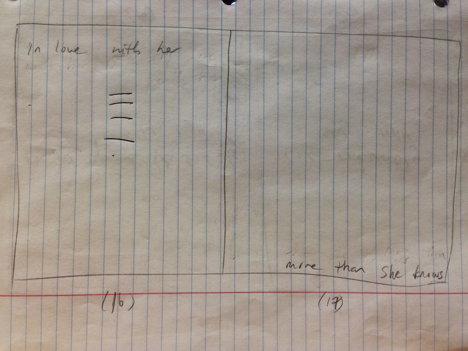
The black and white color scheme, as shown on the second page, was Professor Mata's idea. I think it works well with the book's design and the character development of Barney, because it helps to divide the one spread into two where Barney is shown stating who he is and who he isn't. The black and white is symbolic of the dynamic shift in Barney's personality. Below is the slide of what I am talking about.

Below are my sketches for my monologue. I apologize for not having posted them earlier on in the process.


I think I will add a short intro, similar to the cover and title pages from my monologue. I decided for most of my kinetic type video to remain true to the original layout of the book, because redesigning it all not only would have taken a very long time, but I felt that the way it was laid out originally already showed visual hierarchy and followed the rules of typography, form, and composition fairly well.
The black and white color scheme, as shown on the second page, was Professor Mata's idea. I think it works well with the book's design and the character development of Barney, because it helps to divide the one spread into two where Barney is shown stating who he is and who he isn't. The black and white is symbolic of the dynamic shift in Barney's personality. Below is the slide of what I am talking about.
Below are my sketches for my monologue. I apologize for not having posted them earlier on in the process.
Above are the original sketches that I drew for my monologue book. There are a couple of marks that Professor Mata made to provide insight and feedback that I later incorporated into my book.
Above are pages that I decided to revise to try to create a better design. I didn't realize how spreads worked, so on my original set, I treated some of the sides of the spreads individually from each other. By revising it, I was able to have the text go across the entire spread in some instances.
After I started working on my slides, I realized that two of them in particular needed to be reworked, because how I originally had them laid out was altered as I worked through the project, so the number of pages and spreads that I had did not line up properly. I also had some help on the one slide from my friend Jess Webster who is also a graphic design student right now.
The one that she helped me with is the first of the two below.
Above are the two slides that resulted from the previous sketches.
The colophon isn't shown here, because I added that last and didn't create any sketches for it.
Below is a link to the also the entire script of the monologue, which I researched to make sure that I had heard everything correctly. The script can be found towards the bottom of the page.
I did not do much other research in terms of the meaning behind the script, because I felt that I had enough prior knowledge from watching to the show to understand the emotion and ideology behind it.
Week 14 - Journal Entry 1 - Kinetic Type Research & Ideas
During week 14, we continued to work on our videos. Between the Week 13's class on Thursday and Tuesday's class on Week 14, I managed to almost entirely finish my video.
Ty helped me by showing me how to add a motion blur effect to the type so that it appears to move more smoothly.
Aside from watching the required videos for Edge Animate, I also watched some videos on YouTube to learn a little bit more about kinetic typography. After I switched over to After Effects, I wanted to watch some tutorial videos to see if I could achieve some of the effects I'd seen in previous videos.
They are embedded below.
Although some of these are really successful and well-designed kinetic type videos, some of them also relied a bit heavily on the use of graphics, particularly the last one. I still personally like the video, and I think the use of graphics is great, but without the audio, despite how many times a person watches it, it wouldn't be very effective in conveying the message of the video. So for the purposes of the assignment, I decided to avoid create the connection between graphics and the audio. Instead, I wanted to focus more on just the typography to learn and understand more of the basics and foundation of kinetic typography. Working with graphics also would have taken a very long time, so it was beneficial for me to not have to include any in the video.
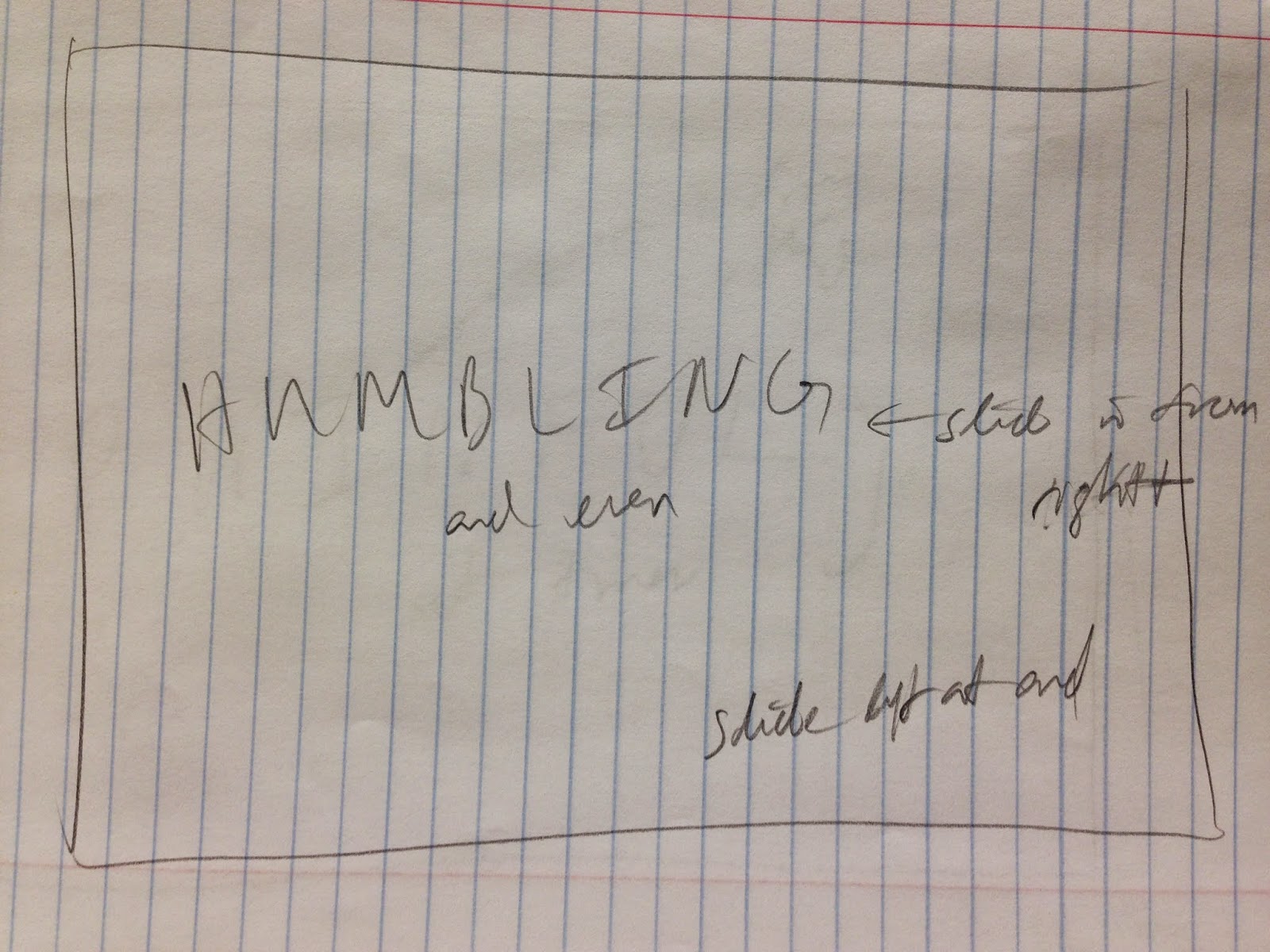
For the video, I chose to stick with the original black and white color scheme and to recreate the spreads from the book. Animating the black triangles in the video so that they come together to create a square not only represents the coming together of both Barney and Robin, but also relates well to Barney's development as a character. After the two squares come together and create a square, the words "I Am" appears inside of it, and it is meant to represent both the more sympathetic and apathetic side of himself coming together to create at the point in the story who has become.
Below are the two slides from the book showing what I am talking about.


Ty helped me by showing me how to add a motion blur effect to the type so that it appears to move more smoothly.
Aside from watching the required videos for Edge Animate, I also watched some videos on YouTube to learn a little bit more about kinetic typography. After I switched over to After Effects, I wanted to watch some tutorial videos to see if I could achieve some of the effects I'd seen in previous videos.
They are embedded below.
The video that was most helpful to me was actually the first video. I mostly wanted to work with the 3D camera feature that they had. Because I was about halfway done with my video because I started trying the 3D camera, it was a bit difficult to go back and rework in the effects smoothly.
I still think everything in my video could have been improved and transitioned more smoothly and efficiently, because I didn't actually lay out all of my text as I probably should have. I ended up learning more about how the 3D camera works from working with it, but I feel much more comfortable with it now.
Some other videos that I watched for inspiration relating to How I Met Your Mother are shown below.
Although some of these are really successful and well-designed kinetic type videos, some of them also relied a bit heavily on the use of graphics, particularly the last one. I still personally like the video, and I think the use of graphics is great, but without the audio, despite how many times a person watches it, it wouldn't be very effective in conveying the message of the video. So for the purposes of the assignment, I decided to avoid create the connection between graphics and the audio. Instead, I wanted to focus more on just the typography to learn and understand more of the basics and foundation of kinetic typography. Working with graphics also would have taken a very long time, so it was beneficial for me to not have to include any in the video.
For the video, I chose to stick with the original black and white color scheme and to recreate the spreads from the book. Animating the black triangles in the video so that they come together to create a square not only represents the coming together of both Barney and Robin, but also relates well to Barney's development as a character. After the two squares come together and create a square, the words "I Am" appears inside of it, and it is meant to represent both the more sympathetic and apathetic side of himself coming together to create at the point in the story who has become.
Below are the two slides from the book showing what I am talking about.
Above are the sketches that I did for kinetic type video showing some directions that I laid out for myself of how I wanted the type to transition in or out. I ended up only changing around some of the transitions and movements, and I haven't animated the title or cover slides yet, so I'm not entirely sure whether or not I'll be sticking with what I have there.
Update:
I am deciding to upload some of the other typography videos that I watched. I originally was not going to include them, because they didn't relate to How I Met Your Mother, but they still were inspiring. Aside from all of the videos that we watched in class (with my favorite 3 or so posted in a separate blog entry below), the other videos I watched are posted below.
Week 13 - Journal Entry 1
During week 13 of the semester, we continued to work on our monologues. Because I did not make a blog entry previous for this week, I'm not exactly sure how far I got with my monologue. I do remember starting in Adobe Edge Animate sometime during the 12th week of classes, and then switching over to using Adobe After Effects, because it was more familiar to me, and I wanted to try out the various effects that could be achieved with it.
I think by the end of class on Thursday of this week, I had only completed animating about half of my slides.
I think by the end of class on Thursday of this week, I had only completed animating about half of my slides.
Subscribe to:
Posts (Atom)