Ty helped me by showing me how to add a motion blur effect to the type so that it appears to move more smoothly.
Aside from watching the required videos for Edge Animate, I also watched some videos on YouTube to learn a little bit more about kinetic typography. After I switched over to After Effects, I wanted to watch some tutorial videos to see if I could achieve some of the effects I'd seen in previous videos.
They are embedded below.
The video that was most helpful to me was actually the first video. I mostly wanted to work with the 3D camera feature that they had. Because I was about halfway done with my video because I started trying the 3D camera, it was a bit difficult to go back and rework in the effects smoothly.
I still think everything in my video could have been improved and transitioned more smoothly and efficiently, because I didn't actually lay out all of my text as I probably should have. I ended up learning more about how the 3D camera works from working with it, but I feel much more comfortable with it now.
Some other videos that I watched for inspiration relating to How I Met Your Mother are shown below.
Although some of these are really successful and well-designed kinetic type videos, some of them also relied a bit heavily on the use of graphics, particularly the last one. I still personally like the video, and I think the use of graphics is great, but without the audio, despite how many times a person watches it, it wouldn't be very effective in conveying the message of the video. So for the purposes of the assignment, I decided to avoid create the connection between graphics and the audio. Instead, I wanted to focus more on just the typography to learn and understand more of the basics and foundation of kinetic typography. Working with graphics also would have taken a very long time, so it was beneficial for me to not have to include any in the video.
For the video, I chose to stick with the original black and white color scheme and to recreate the spreads from the book. Animating the black triangles in the video so that they come together to create a square not only represents the coming together of both Barney and Robin, but also relates well to Barney's development as a character. After the two squares come together and create a square, the words "I Am" appears inside of it, and it is meant to represent both the more sympathetic and apathetic side of himself coming together to create at the point in the story who has become.
Below are the two slides from the book showing what I am talking about.


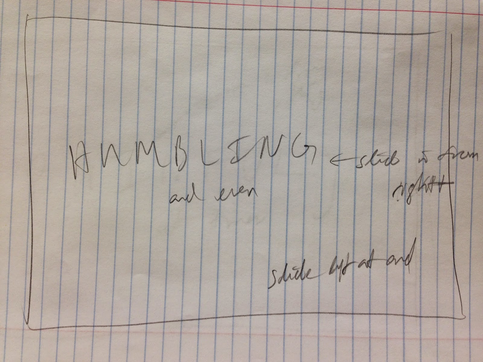


Above are the sketches that I did for kinetic type video showing some directions that I laid out for myself of how I wanted the type to transition in or out. I ended up only changing around some of the transitions and movements, and I haven't animated the title or cover slides yet, so I'm not entirely sure whether or not I'll be sticking with what I have there.
Update:
I am deciding to upload some of the other typography videos that I watched. I originally was not going to include them, because they didn't relate to How I Met Your Mother, but they still were inspiring. Aside from all of the videos that we watched in class (with my favorite 3 or so posted in a separate blog entry below), the other videos I watched are posted below.
0 comments:
Post a Comment