It is the final week of the semester. During our final period today, we critiqued everyone's monologue videos. It was really great to see how far everyone developed theirs and the improvements that they made. I thought they were all great, and some of them particularly stood out to me. It was a fun, helpful, and tough, but fulfilling semester. I look forward to taking type 2 class next semester.
Tuesday, December 9, 2014
Tuesday, December 2, 2014
Week 15 - Journal Entry 1 - Kinetic Type Video Update & Monologue Book, Concept, and Conceptual Research
I have added a colophon to my kinetic type video, and tweaked a few areas of the video where I received feedback for last class. One major area is where the triangles in my video overlap, which I will be posting later once it is fully complete. I plan to upload it to youtube first, so that I can embed it to different places such as my online portfolio and here.
I think I will add a short intro, similar to the cover and title pages from my monologue. I decided for most of my kinetic type video to remain true to the original layout of the book, because redesigning it all not only would have taken a very long time, but I felt that the way it was laid out originally already showed visual hierarchy and followed the rules of typography, form, and composition fairly well.
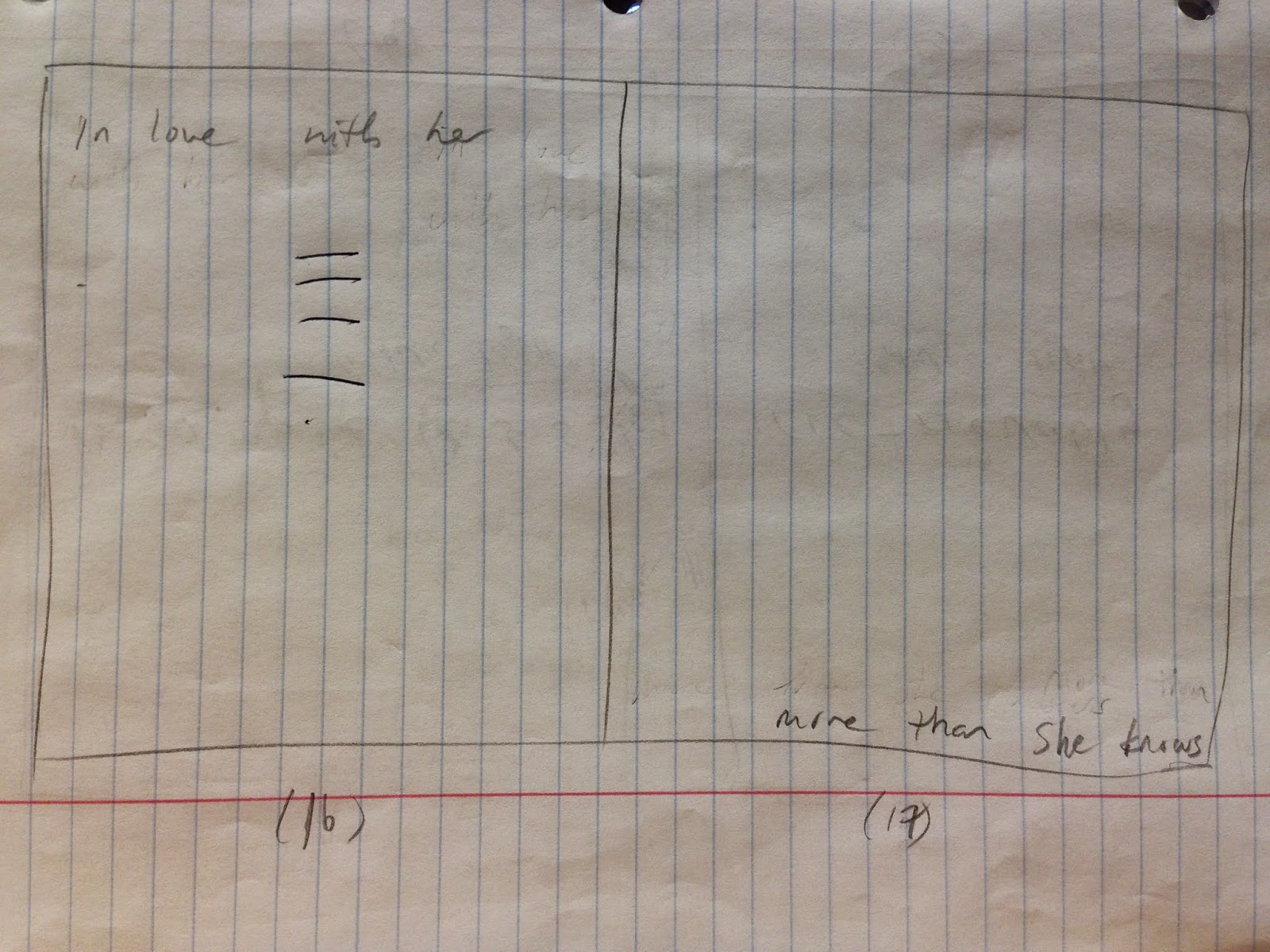
The black and white color scheme, as shown on the second page, was Professor Mata's idea. I think it works well with the book's design and the character development of Barney, because it helps to divide the one spread into two where Barney is shown stating who he is and who he isn't. The black and white is symbolic of the dynamic shift in Barney's personality. Below is the slide of what I am talking about.

Below are my sketches for my monologue. I apologize for not having posted them earlier on in the process.


I think I will add a short intro, similar to the cover and title pages from my monologue. I decided for most of my kinetic type video to remain true to the original layout of the book, because redesigning it all not only would have taken a very long time, but I felt that the way it was laid out originally already showed visual hierarchy and followed the rules of typography, form, and composition fairly well.
The black and white color scheme, as shown on the second page, was Professor Mata's idea. I think it works well with the book's design and the character development of Barney, because it helps to divide the one spread into two where Barney is shown stating who he is and who he isn't. The black and white is symbolic of the dynamic shift in Barney's personality. Below is the slide of what I am talking about.
Below are my sketches for my monologue. I apologize for not having posted them earlier on in the process.
Above are the original sketches that I drew for my monologue book. There are a couple of marks that Professor Mata made to provide insight and feedback that I later incorporated into my book.
Above are pages that I decided to revise to try to create a better design. I didn't realize how spreads worked, so on my original set, I treated some of the sides of the spreads individually from each other. By revising it, I was able to have the text go across the entire spread in some instances.
After I started working on my slides, I realized that two of them in particular needed to be reworked, because how I originally had them laid out was altered as I worked through the project, so the number of pages and spreads that I had did not line up properly. I also had some help on the one slide from my friend Jess Webster who is also a graphic design student right now.
The one that she helped me with is the first of the two below.
Above are the two slides that resulted from the previous sketches.
The colophon isn't shown here, because I added that last and didn't create any sketches for it.
Below is a link to the also the entire script of the monologue, which I researched to make sure that I had heard everything correctly. The script can be found towards the bottom of the page.
I did not do much other research in terms of the meaning behind the script, because I felt that I had enough prior knowledge from watching to the show to understand the emotion and ideology behind it.
Week 14 - Journal Entry 1 - Kinetic Type Research & Ideas
During week 14, we continued to work on our videos. Between the Week 13's class on Thursday and Tuesday's class on Week 14, I managed to almost entirely finish my video.
Ty helped me by showing me how to add a motion blur effect to the type so that it appears to move more smoothly.
Aside from watching the required videos for Edge Animate, I also watched some videos on YouTube to learn a little bit more about kinetic typography. After I switched over to After Effects, I wanted to watch some tutorial videos to see if I could achieve some of the effects I'd seen in previous videos.
They are embedded below.
Although some of these are really successful and well-designed kinetic type videos, some of them also relied a bit heavily on the use of graphics, particularly the last one. I still personally like the video, and I think the use of graphics is great, but without the audio, despite how many times a person watches it, it wouldn't be very effective in conveying the message of the video. So for the purposes of the assignment, I decided to avoid create the connection between graphics and the audio. Instead, I wanted to focus more on just the typography to learn and understand more of the basics and foundation of kinetic typography. Working with graphics also would have taken a very long time, so it was beneficial for me to not have to include any in the video.
For the video, I chose to stick with the original black and white color scheme and to recreate the spreads from the book. Animating the black triangles in the video so that they come together to create a square not only represents the coming together of both Barney and Robin, but also relates well to Barney's development as a character. After the two squares come together and create a square, the words "I Am" appears inside of it, and it is meant to represent both the more sympathetic and apathetic side of himself coming together to create at the point in the story who has become.
Below are the two slides from the book showing what I am talking about.


Ty helped me by showing me how to add a motion blur effect to the type so that it appears to move more smoothly.
Aside from watching the required videos for Edge Animate, I also watched some videos on YouTube to learn a little bit more about kinetic typography. After I switched over to After Effects, I wanted to watch some tutorial videos to see if I could achieve some of the effects I'd seen in previous videos.
They are embedded below.
The video that was most helpful to me was actually the first video. I mostly wanted to work with the 3D camera feature that they had. Because I was about halfway done with my video because I started trying the 3D camera, it was a bit difficult to go back and rework in the effects smoothly.
I still think everything in my video could have been improved and transitioned more smoothly and efficiently, because I didn't actually lay out all of my text as I probably should have. I ended up learning more about how the 3D camera works from working with it, but I feel much more comfortable with it now.
Some other videos that I watched for inspiration relating to How I Met Your Mother are shown below.
Although some of these are really successful and well-designed kinetic type videos, some of them also relied a bit heavily on the use of graphics, particularly the last one. I still personally like the video, and I think the use of graphics is great, but without the audio, despite how many times a person watches it, it wouldn't be very effective in conveying the message of the video. So for the purposes of the assignment, I decided to avoid create the connection between graphics and the audio. Instead, I wanted to focus more on just the typography to learn and understand more of the basics and foundation of kinetic typography. Working with graphics also would have taken a very long time, so it was beneficial for me to not have to include any in the video.
For the video, I chose to stick with the original black and white color scheme and to recreate the spreads from the book. Animating the black triangles in the video so that they come together to create a square not only represents the coming together of both Barney and Robin, but also relates well to Barney's development as a character. After the two squares come together and create a square, the words "I Am" appears inside of it, and it is meant to represent both the more sympathetic and apathetic side of himself coming together to create at the point in the story who has become.
Below are the two slides from the book showing what I am talking about.
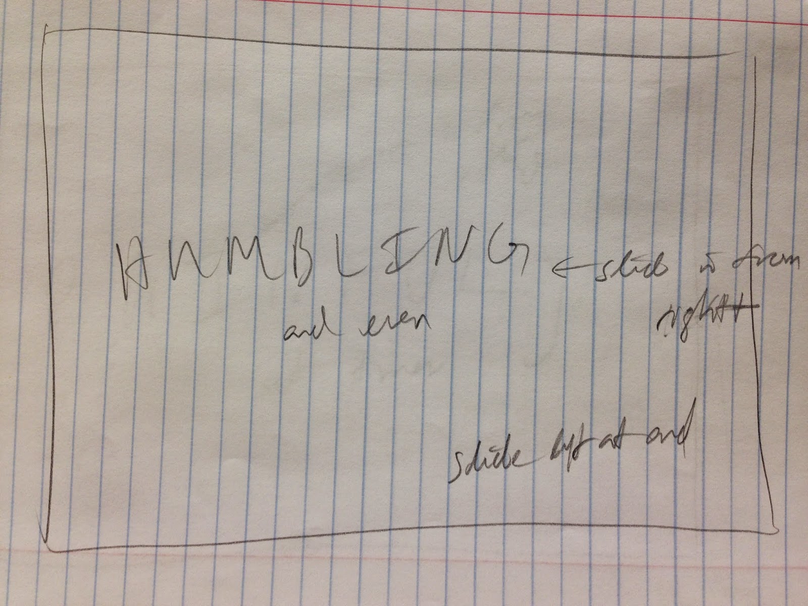
Above are the sketches that I did for kinetic type video showing some directions that I laid out for myself of how I wanted the type to transition in or out. I ended up only changing around some of the transitions and movements, and I haven't animated the title or cover slides yet, so I'm not entirely sure whether or not I'll be sticking with what I have there.
Update:
I am deciding to upload some of the other typography videos that I watched. I originally was not going to include them, because they didn't relate to How I Met Your Mother, but they still were inspiring. Aside from all of the videos that we watched in class (with my favorite 3 or so posted in a separate blog entry below), the other videos I watched are posted below.
Week 13 - Journal Entry 1
During week 13 of the semester, we continued to work on our monologues. Because I did not make a blog entry previous for this week, I'm not exactly sure how far I got with my monologue. I do remember starting in Adobe Edge Animate sometime during the 12th week of classes, and then switching over to using Adobe After Effects, because it was more familiar to me, and I wanted to try out the various effects that could be achieved with it.
I think by the end of class on Thursday of this week, I had only completed animating about half of my slides.
I think by the end of class on Thursday of this week, I had only completed animating about half of my slides.
Thursday, November 13, 2014
Off-Campus Event - Week 12 - Journal Entry 2
On September 11th, we went to an event at Thaddeus Stevens College of Technology.
The event was about letterpress printing, which is a craft that has become less practical and less utilized since the creation of digital printers.
We started the event by covering the history of typography and the printing press. Then, we started working on creating our own note pads. It was interesting to be able to see what a type case looked like visually and to see how the upper and lower cases related to how the terms are used today. It would definitely be tedious to have to organize all of the letters in the type case to be sure that they are in the right place. What’s also interesting was learning about the amount of type cases that would be present at certain companies. Some newspaper companies would have entire floors filled with all of the numerous type cases containing different fonts.
We were shown how to place and organize the letters so that they would stay in place with the addition of spacers to prepare them for the letterpress. I chose to create my name. It had to be created backwards.
Although we weren’t able to choose which font we got, I received a sans-serif which I was happy with. It looked like Futura, but I can’t remember whether or not that is what it was. We then were shown how to apply ink to our name to test it.
After that, we were taken in to the letterpress room to start creating the individual pages of our notepad. I chose to use white paper with red ink. It was interesting how loud the room became with only four or five letterpresses working at once. It was time-consuming to create only a small notepad, but the effect that the letterpress created by imprinting the shape of the letters into the paper created a very artistic effect that isn’t possibly with inkjet printers. I would have enjoyed seeing decorative type created with the letterpress, much like how they are shown on formal invitations. Overall, my notepad turned out quite well.
At the end of the event, we had to move the type cases back into their shelves.
The event certainly gave me a new appreciation for typography and the practice of letterpress printing. It would be great if there were a way to letter press print without having to manually create it every time. The imprint of the type is beautiful and would look great on posters, magazines, and even research papers.
We also “liked” the .918 Club on Facebook, which is a non-profit organization in Lancaster City devoted to keeping the practice of letter press printing active and educating and involving those who are interested in it.
Below is a picture showing how my notepad looked after it was completed. The angle of it helps to show the slight imprint from the weight of the letterpress.

Tuesday, November 11, 2014
Week 12 - Journal Entry 1 - Monologue Book Critique
I am critiquing Nick's book, titled "Baxter Eats a Whole Wheel of Cheese," which is from the Anchorman movie.

The cover of the book is well crafted, and it feels and acts as a legitimate cover for a commercial book would. The thickness and color of it contrasts well against the content pages of the book. The left edge is black, but appears slightly blue in the picture because of the lighting.

The title page is simple and centered, with the name "Baxter" being in a larger type-size than the rest of the title which emphasizes it well. There is a good connection between the black edge on the front cover with the black back cover, as well as with the color of the typeface.

Nick does a good job throughout the entire book of placing the dog's barks in a way that makes it readable and legible, but not detracting from the main monologue (or dialogue if you count the dog). I get the sense that the dog's barks would be audible in the background noise. Centering the words "you're so wise" helps to lead into the type on next page. The repetition of the black background balances the backside of the front cover. The ellipsis makes me think that the first part is spoken slightly softer. Emphasis is placed well.

The best part about this spread is probably how the positive and negative spaces work together in separating Ron Burgundy's speech from Baxter's (the dog). Angling the last "arf" adds variety and interest to the spread which consists mostly of diagonals in one direction. Putting it in a larger type-size also emphasizes it and makes it appear louder visually.
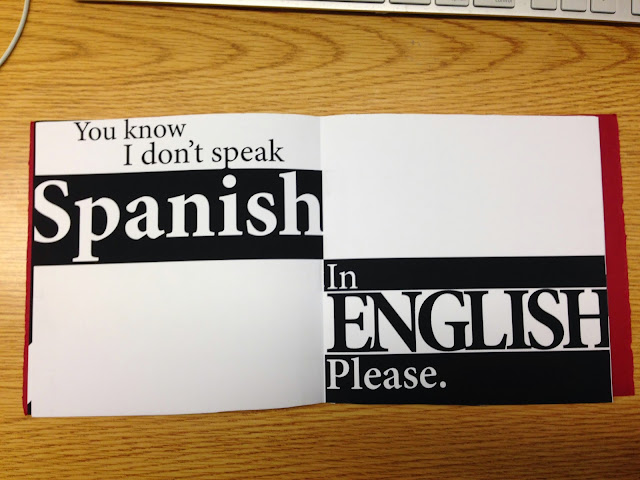
The contrast of shapes here again help to emphasize "Spanish" and "English." By having both words contain inverted colors of each other, it attracts attention and creates hierarchy while sectioning the spread as well. Capitalizing the word "English" helps to put more emphasis on it than the word Spanish.

This was a cleverly designed spread. By having only two onomatopoeias on the same spread, it puts the two of them at odds against one another while also connecting them, since they're not actually words. The "huh" takes precedence by size, and it also represents a sense of dominance as if Ron would not only be extremely confused in the dialogue, but louder as well.

Again, Nick brings back the smaller "arfs" to represent background noise and adds harmony to the book. The variation in type-size here creates a sense of hierarchy while maintaining readability. The words "in the" seem positioned well, leading off from the tail of the "p."

The curvature of the type here works well in following the curves of the circle and representing a wheel of cheese. Centering the type on the left helps to lead the reader into the right side.

The diagonal here adds interest to the book, but I get slightly confused from the hierarchy of it. The black diagonal makes me think that there is an emphasis on the words "you do" because most books generally have plain white pages as the background. I would personally have placed just an emphasis on the word "you," but I could also see how the word "do" could be included in that to emphasize not just the subject but the action as well.

This spread seems slightly more complex, because of the two black boxes. This spread could be read starting with the black box on the left, black box on the right, then lastly the type in the middle... or it could be read starting with the black box on the left, type in the middle, and lastly black box on the right. Although it would visually appear that they should be grouped together, the order of the monologue is still represented properly because of the hyphen. It helps to show that there is a pause/cut in the speech and leads into the type in the middle. Enlarging the type helps to give it dominance and draw the reader's attention to it and follow the flow of reading from left to right.
Overall, I thought Nick did a great job on the his monologue. It is well-crafted. The black and red colors match Ron's actual attire in the movie. He used a single typeface and no more than two colors. There is balance, harmony, and variety. The sizes of the spread appear correct and he met the minimum requirement of having at least 6 spreads. The colophon is included despite there not being a picture of it incase he would have wanted his last name confidential.

The cover of the book is well crafted, and it feels and acts as a legitimate cover for a commercial book would. The thickness and color of it contrasts well against the content pages of the book. The left edge is black, but appears slightly blue in the picture because of the lighting.

The title page is simple and centered, with the name "Baxter" being in a larger type-size than the rest of the title which emphasizes it well. There is a good connection between the black edge on the front cover with the black back cover, as well as with the color of the typeface.


The best part about this spread is probably how the positive and negative spaces work together in separating Ron Burgundy's speech from Baxter's (the dog). Angling the last "arf" adds variety and interest to the spread which consists mostly of diagonals in one direction. Putting it in a larger type-size also emphasizes it and makes it appear louder visually.

The contrast of shapes here again help to emphasize "Spanish" and "English." By having both words contain inverted colors of each other, it attracts attention and creates hierarchy while sectioning the spread as well. Capitalizing the word "English" helps to put more emphasis on it than the word Spanish.

This was a cleverly designed spread. By having only two onomatopoeias on the same spread, it puts the two of them at odds against one another while also connecting them, since they're not actually words. The "huh" takes precedence by size, and it also represents a sense of dominance as if Ron would not only be extremely confused in the dialogue, but louder as well.

Again, Nick brings back the smaller "arfs" to represent background noise and adds harmony to the book. The variation in type-size here creates a sense of hierarchy while maintaining readability. The words "in the" seem positioned well, leading off from the tail of the "p."

The curvature of the type here works well in following the curves of the circle and representing a wheel of cheese. Centering the type on the left helps to lead the reader into the right side.

The diagonal here adds interest to the book, but I get slightly confused from the hierarchy of it. The black diagonal makes me think that there is an emphasis on the words "you do" because most books generally have plain white pages as the background. I would personally have placed just an emphasis on the word "you," but I could also see how the word "do" could be included in that to emphasize not just the subject but the action as well.

This spread seems slightly more complex, because of the two black boxes. This spread could be read starting with the black box on the left, black box on the right, then lastly the type in the middle... or it could be read starting with the black box on the left, type in the middle, and lastly black box on the right. Although it would visually appear that they should be grouped together, the order of the monologue is still represented properly because of the hyphen. It helps to show that there is a pause/cut in the speech and leads into the type in the middle. Enlarging the type helps to give it dominance and draw the reader's attention to it and follow the flow of reading from left to right.
Overall, I thought Nick did a great job on the his monologue. It is well-crafted. The black and red colors match Ron's actual attire in the movie. He used a single typeface and no more than two colors. There is balance, harmony, and variety. The sizes of the spread appear correct and he met the minimum requirement of having at least 6 spreads. The colophon is included despite there not being a picture of it incase he would have wanted his last name confidential.
Subscribe to:
Posts (Atom)