The cover of the book is well crafted, and it feels and acts as a legitimate cover for a commercial book would. The thickness and color of it contrasts well against the content pages of the book. The left edge is black, but appears slightly blue in the picture because of the lighting.
The title page is simple and centered, with the name "Baxter" being in a larger type-size than the rest of the title which emphasizes it well. There is a good connection between the black edge on the front cover with the black back cover, as well as with the color of the typeface.
The best part about this spread is probably how the positive and negative spaces work together in separating Ron Burgundy's speech from Baxter's (the dog). Angling the last "arf" adds variety and interest to the spread which consists mostly of diagonals in one direction. Putting it in a larger type-size also emphasizes it and makes it appear louder visually.
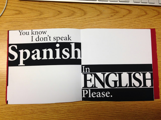
The contrast of shapes here again help to emphasize "Spanish" and "English." By having both words contain inverted colors of each other, it attracts attention and creates hierarchy while sectioning the spread as well. Capitalizing the word "English" helps to put more emphasis on it than the word Spanish.
This was a cleverly designed spread. By having only two onomatopoeias on the same spread, it puts the two of them at odds against one another while also connecting them, since they're not actually words. The "huh" takes precedence by size, and it also represents a sense of dominance as if Ron would not only be extremely confused in the dialogue, but louder as well.
Again, Nick brings back the smaller "arfs" to represent background noise and adds harmony to the book. The variation in type-size here creates a sense of hierarchy while maintaining readability. The words "in the" seem positioned well, leading off from the tail of the "p."
The curvature of the type here works well in following the curves of the circle and representing a wheel of cheese. Centering the type on the left helps to lead the reader into the right side.
The diagonal here adds interest to the book, but I get slightly confused from the hierarchy of it. The black diagonal makes me think that there is an emphasis on the words "you do" because most books generally have plain white pages as the background. I would personally have placed just an emphasis on the word "you," but I could also see how the word "do" could be included in that to emphasize not just the subject but the action as well.
This spread seems slightly more complex, because of the two black boxes. This spread could be read starting with the black box on the left, black box on the right, then lastly the type in the middle... or it could be read starting with the black box on the left, type in the middle, and lastly black box on the right. Although it would visually appear that they should be grouped together, the order of the monologue is still represented properly because of the hyphen. It helps to show that there is a pause/cut in the speech and leads into the type in the middle. Enlarging the type helps to give it dominance and draw the reader's attention to it and follow the flow of reading from left to right.
Overall, I thought Nick did a great job on the his monologue. It is well-crafted. The black and red colors match Ron's actual attire in the movie. He used a single typeface and no more than two colors. There is balance, harmony, and variety. The sizes of the spread appear correct and he met the minimum requirement of having at least 6 spreads. The colophon is included despite there not being a picture of it incase he would have wanted his last name confidential.


0 comments:
Post a Comment